Country Fire Authority.
Bring a legacy system into the 21st century; Empower firefighters to efficiently and independently record emergency incidents.
Project
Fire & Incident Reporting System
Role
Senior Product Designer
Duration
2 years
Year
2020 - 2022
Problem Statement
When it comes time for firefighters to record what happened at an incident, they call the Service Delivery Reporting Centre (SDRC). This can involve lengthy calls, and sometimes being stuck on hold for hours. This backlog of calls has led to reduced compliance, inaccurate data, and decreased visibility of incident reports.
Introduction
In an emergency situation, a call is made to ESTA (000) and an incident is created. CFA is notified and responds as quickly as possible. After the incident, it’s important that each brigade captures what happened. That’s where the FIRS comes in.
FIRS is a desktop application that was built in the 90’s and is utilised by multiple emergency services and states across Australia to record what happened at an incident. Safe to say it was due for an overhaul.
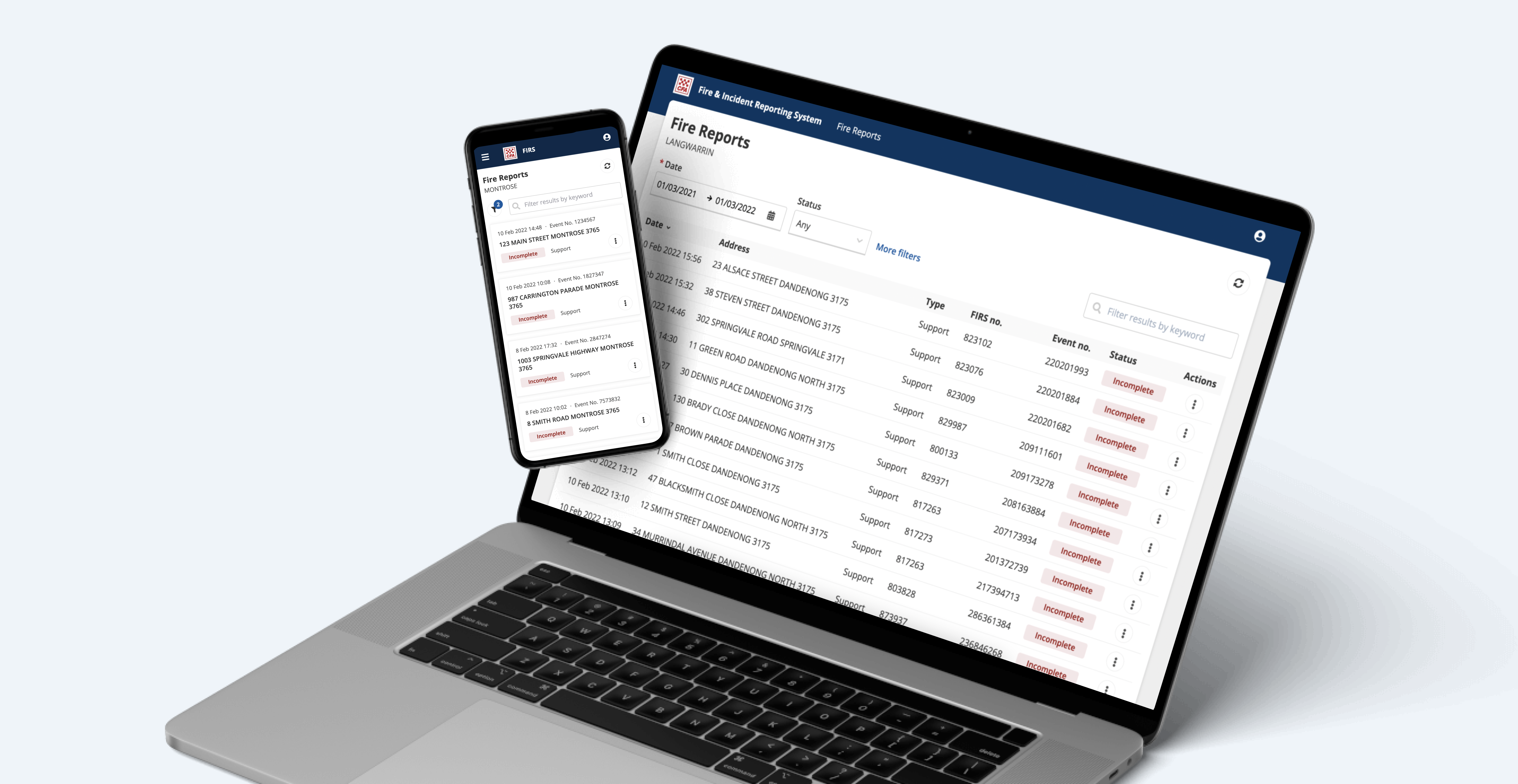
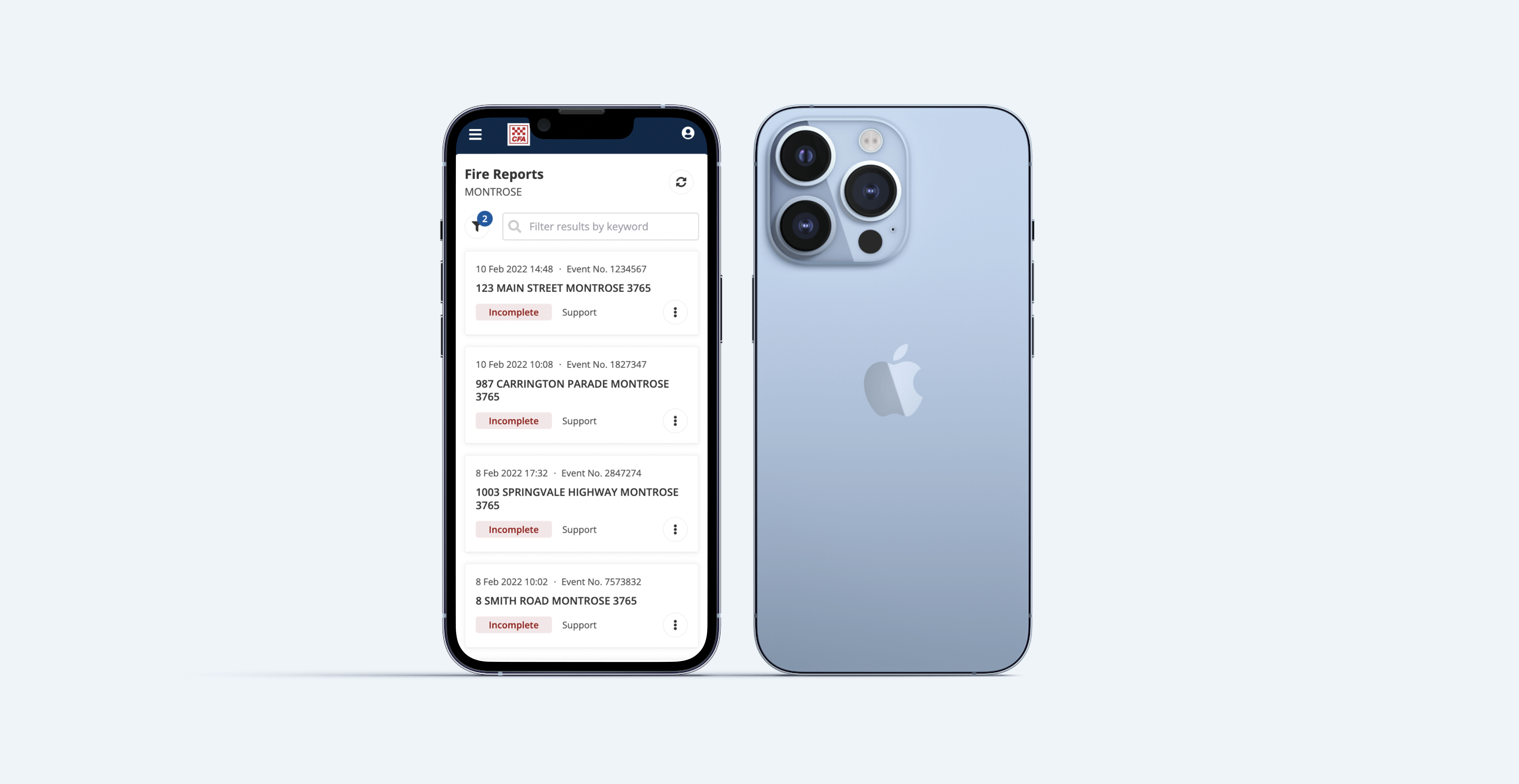
FIRS was redesigned to allow brigades to complete their own incident reports online—wherever and whenever they like. Solving major accessibility and usability issues, ultimately saving time, improving report visibility and data integrity.
Design Process
During exploration, I learnt the ins and outs of the existing application by experimenting in a training database and working closely with the business analyst to understand the business rules. I then undertook a usability evaluation with the goal of identifying any issues that should be resolved in the new design.
We conducted user interviews to gain a deeper understanding of the current process, pain points and needs / wants of SDRC and brigade members. After completing the interviews, we identified various personas and created an affinity map to make sense of all the findings.
To understand the interviews in a meaningful way, we created an affinity map. This slowly revealed key themes such as personas, needs / wants, current process and pain points. Perfect!
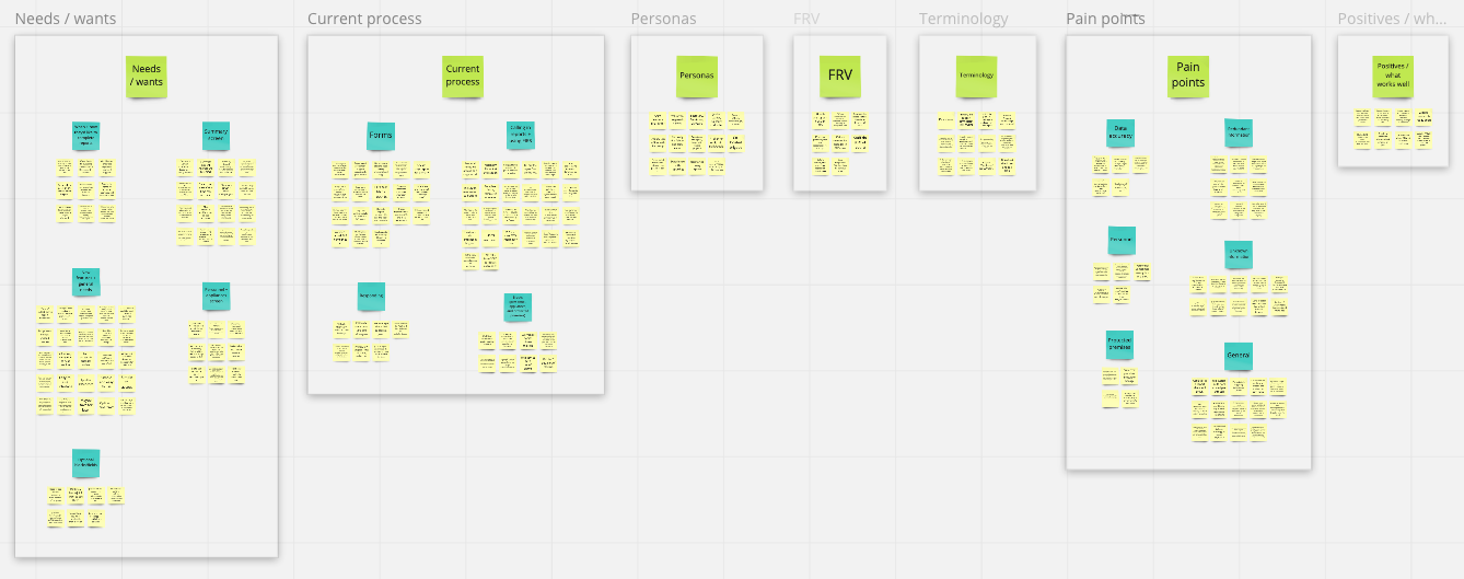
We got some really great insight from these interviews, like most brigades would call SDRC on a Sunday, resulting in wait times over an hour, terminology didn’t match the real world, a heap of accessibility issues, poor error handling/prevention and no sense of progress. After this, I had in-depth discussions with SDRC and brigade members about the specifics of each screen before getting stuck into the UI design.
My general process was to start with a bare bones sketch, iterating until I found a few that would make the cut. Next, I brought the sketches to life in Figma, designing with a mobile-first approach. Finally I uploaded to Miro, ready for design review and developer handover.
Here’s a sneak peak at what some of the legacy screens looked like:
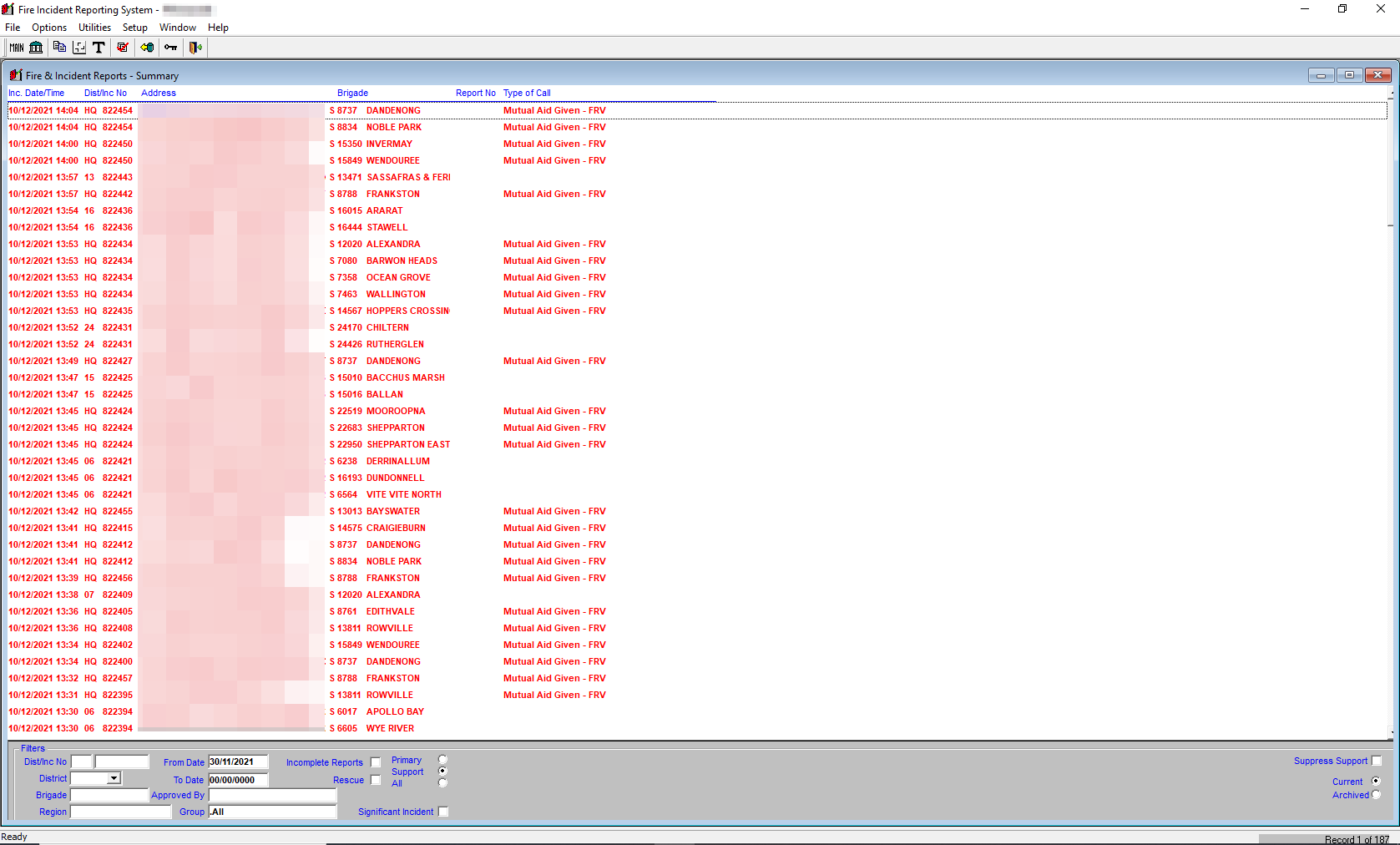
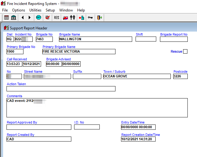
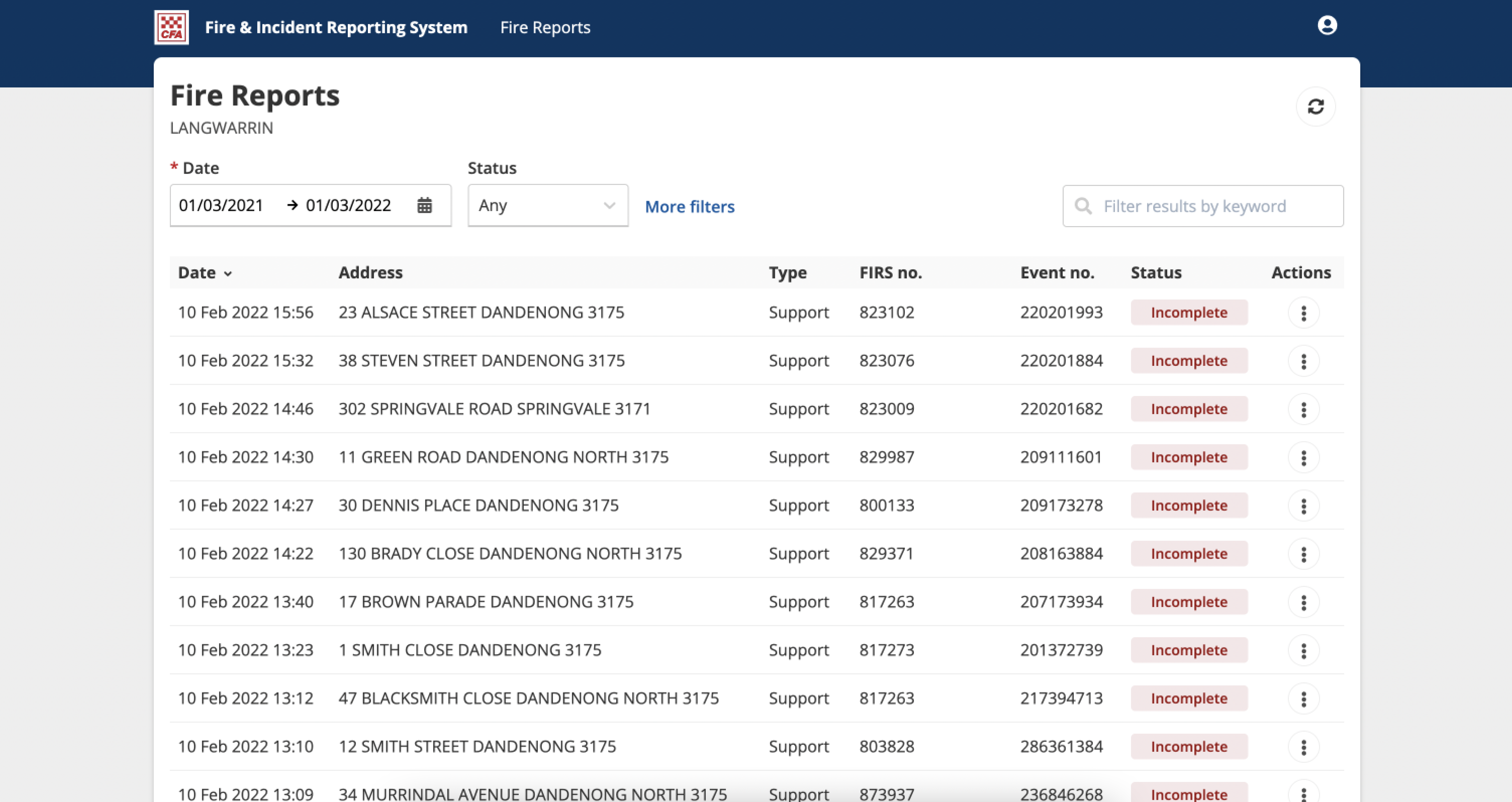
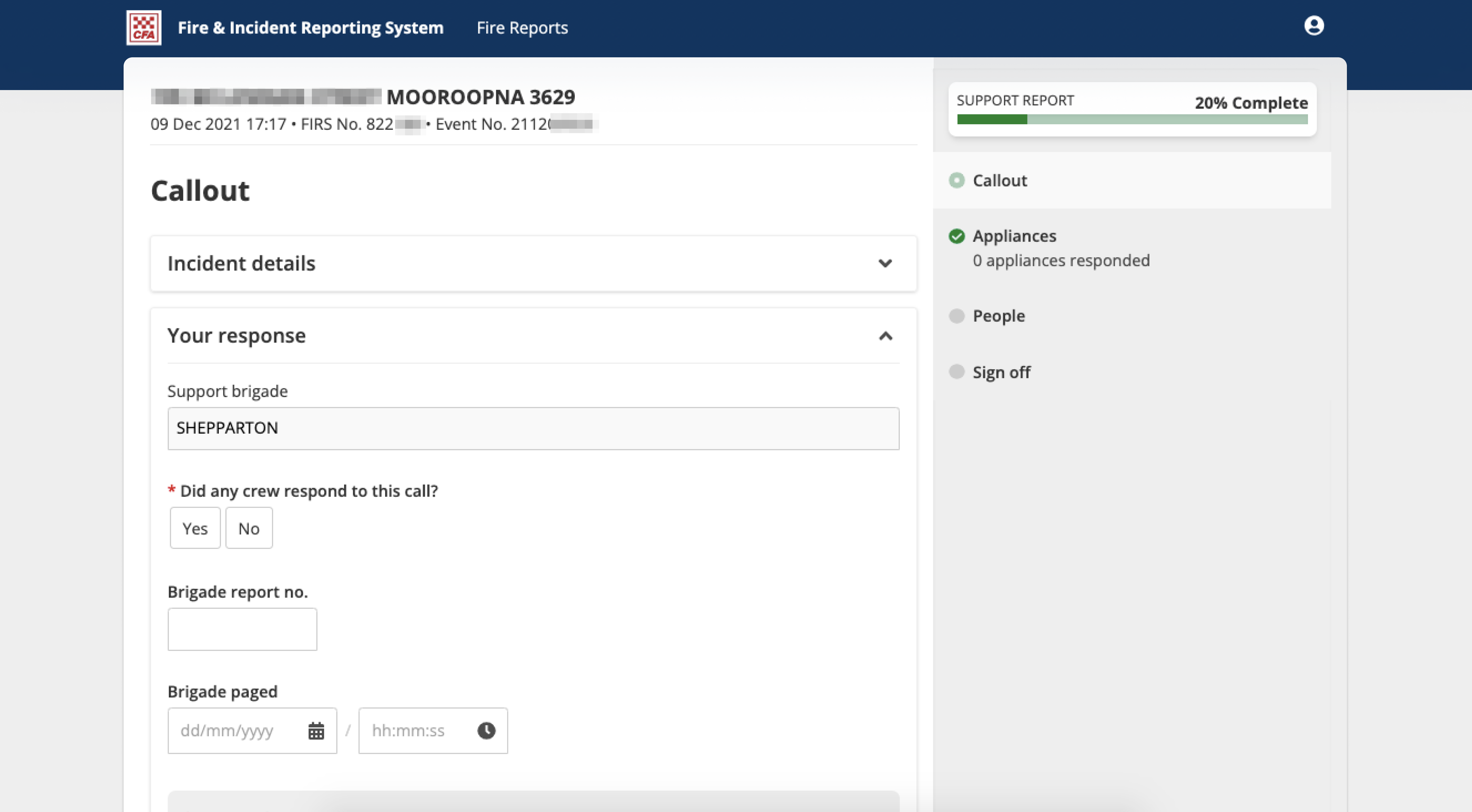
Here’s a couple of problem areas that were addressed with the redesign:
- Removed unnecessary / harmful filters
- Simplified filters by only showing the most used and hiding all other filters in a “more filters” section to reduce clutter
- Removed unused features and information like “save filters” and replaced with accurate defaults
- Added handy features like a keyword search, help text for tricky fields, inline error validation and clear indications for required fields
- Used accordions and vertical tabs to chunk information into logical groups
- Simplified navigation by providing a clear sense of progress with a green tick and progress bar
- Revised terminology to ensure it matched the Brigade members’ expectations
Next up was a design review with SDRC to make sure they were happy with everything and if any changes were required. If all went well, then it was onto the developer handover meeting which consisted of a Miro walkthrough and discussing any technical constraints. If there were still some things that needed revision then I’d take it back to design and iterate.
Results
