Department of Transport.
Streamline the digital experience for Victorians trying to find transport information online.
Project
Transport Victoria
Role
Senior UI Designer
Duration
9 months
Year
2024
Problem Statement
Victorians rely on multiple organisations and platforms to find relevant transport information. This can lead to confusion and increased cognitive load when trying to determine which website or mobile app to visit. It has also resulted in a disjointed digital identity for the Department of Transport and Planning (DTP).
Introduction
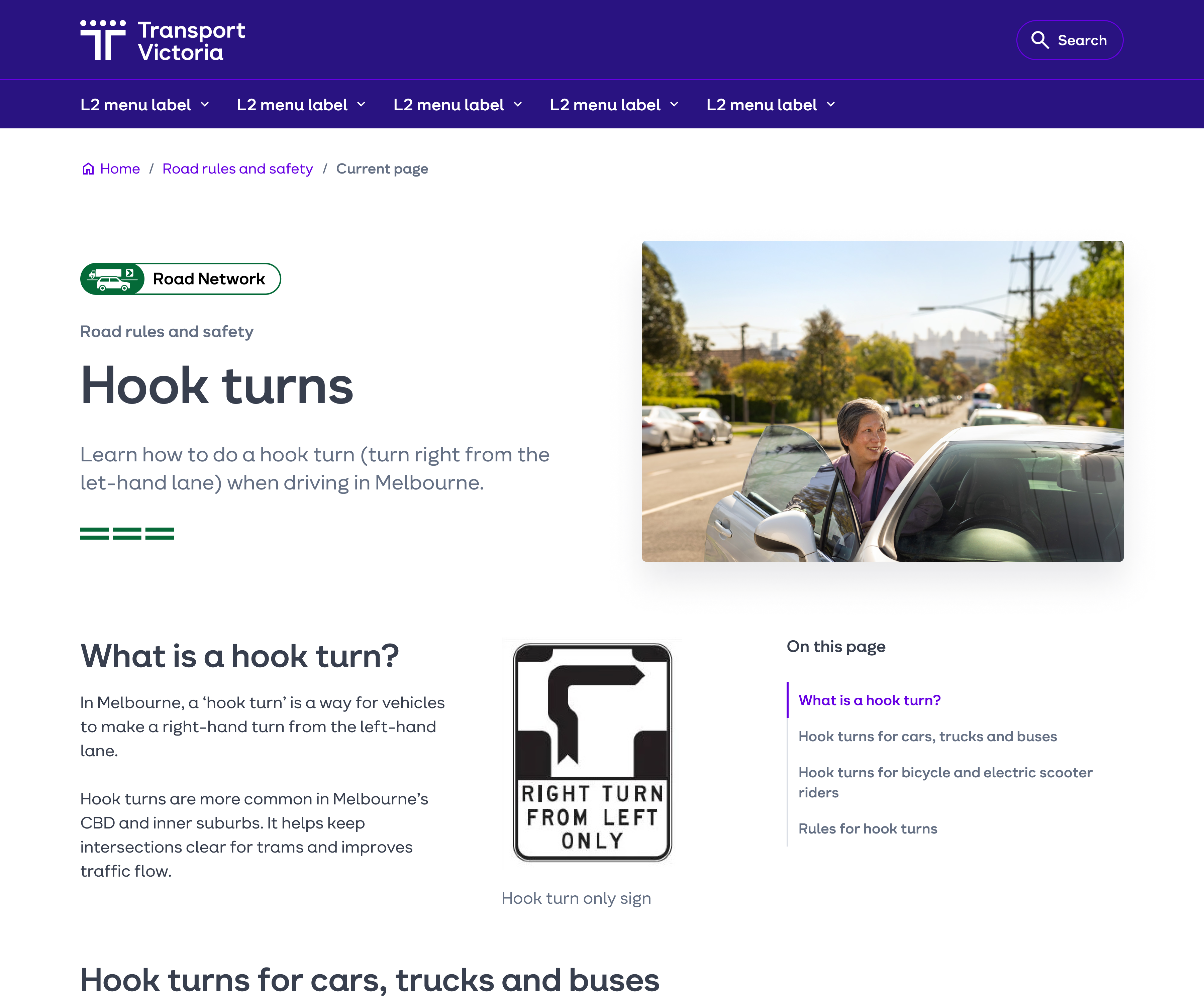
In Victoria, there’s lots of different ways to get around. Whether you’re driving to the beach, catching the train into the city, or zipping around on an electric scooter. Questions often pop up like how do I perform one of those pesky hook turns, what time does the train leave, and how do I pay for an electric scooter? Users often find themselves jumping between different platforms and organisations to find these answers.
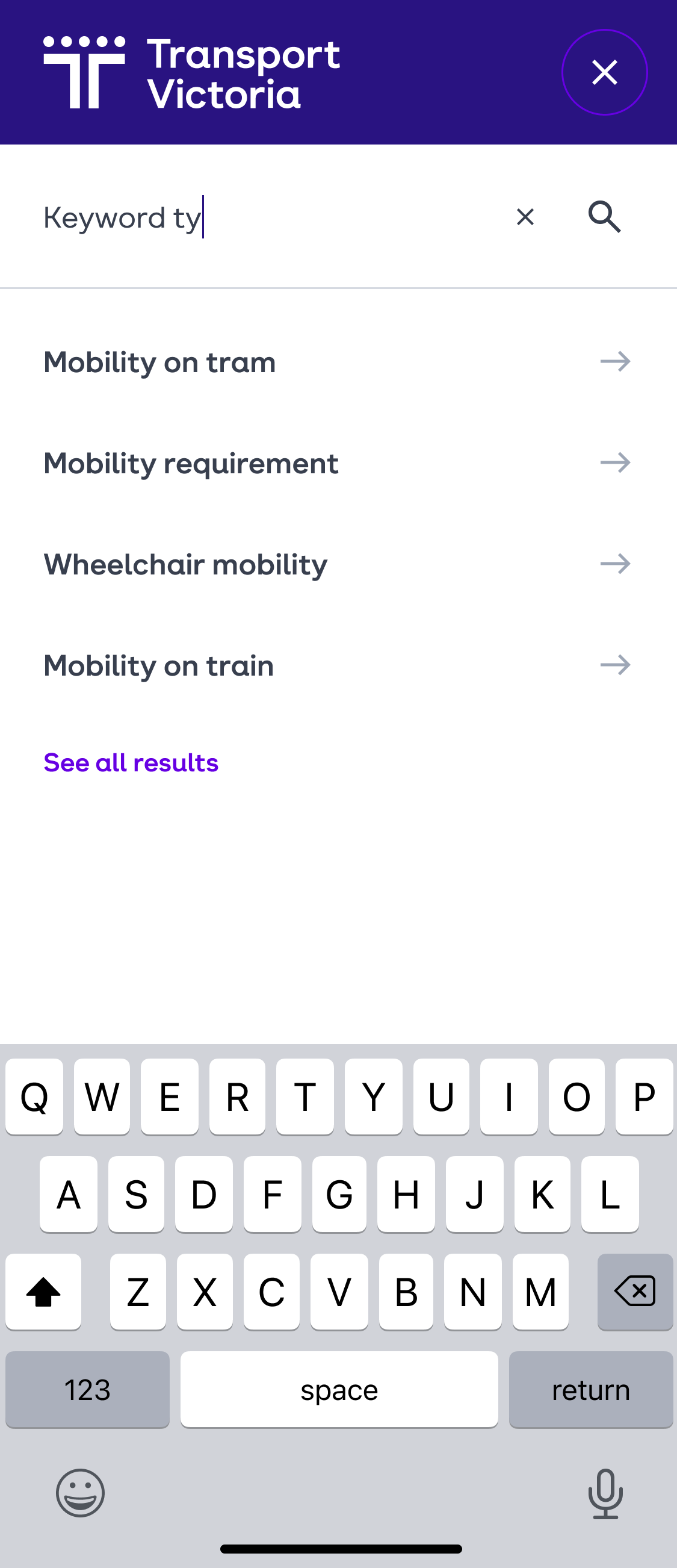
To help address these concerns, we designed a scalable CMS-based website that brought together two major brands within the Victorian Transport industry: VicRoads and PTV. Scalability was a key focus for this piece as the aim was to integrate more brands later down the track.
Design Process
I joined this project shortly after it began. A bespoke design system was in the works but still in its infancy. Building upon this design system was one of my main focuses on this project.
The team and I were able to design in a consistent and scalable way thanks to the atomic design methodology and usage of documentation. An interesting aspect of this was the importance of variable names and values within components. As the components would be dragged-and-dropped onto the page by content authors, these had to be in plain english. No design lingo!
Quite often changes would come up while working on the design system, whether it be from accessibility testing, changes in developer requirements or simply enhancing visual impact. Of course this was to be expected! A design system is a product that will continually evolve. We tracked these changes with the help of a change log, which was shared with the rest of the team. This kept everything crystal clear both within and between disciplines.
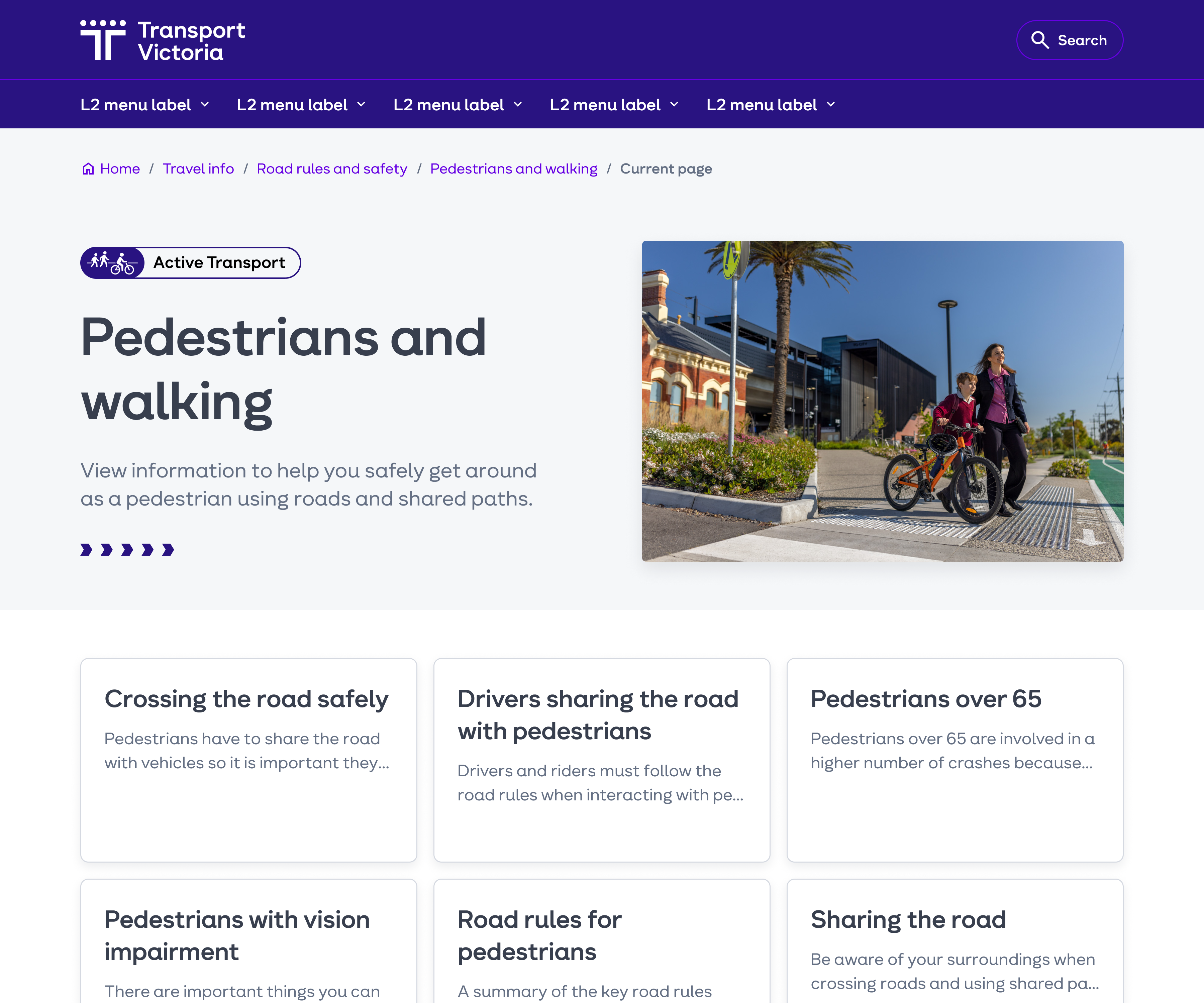
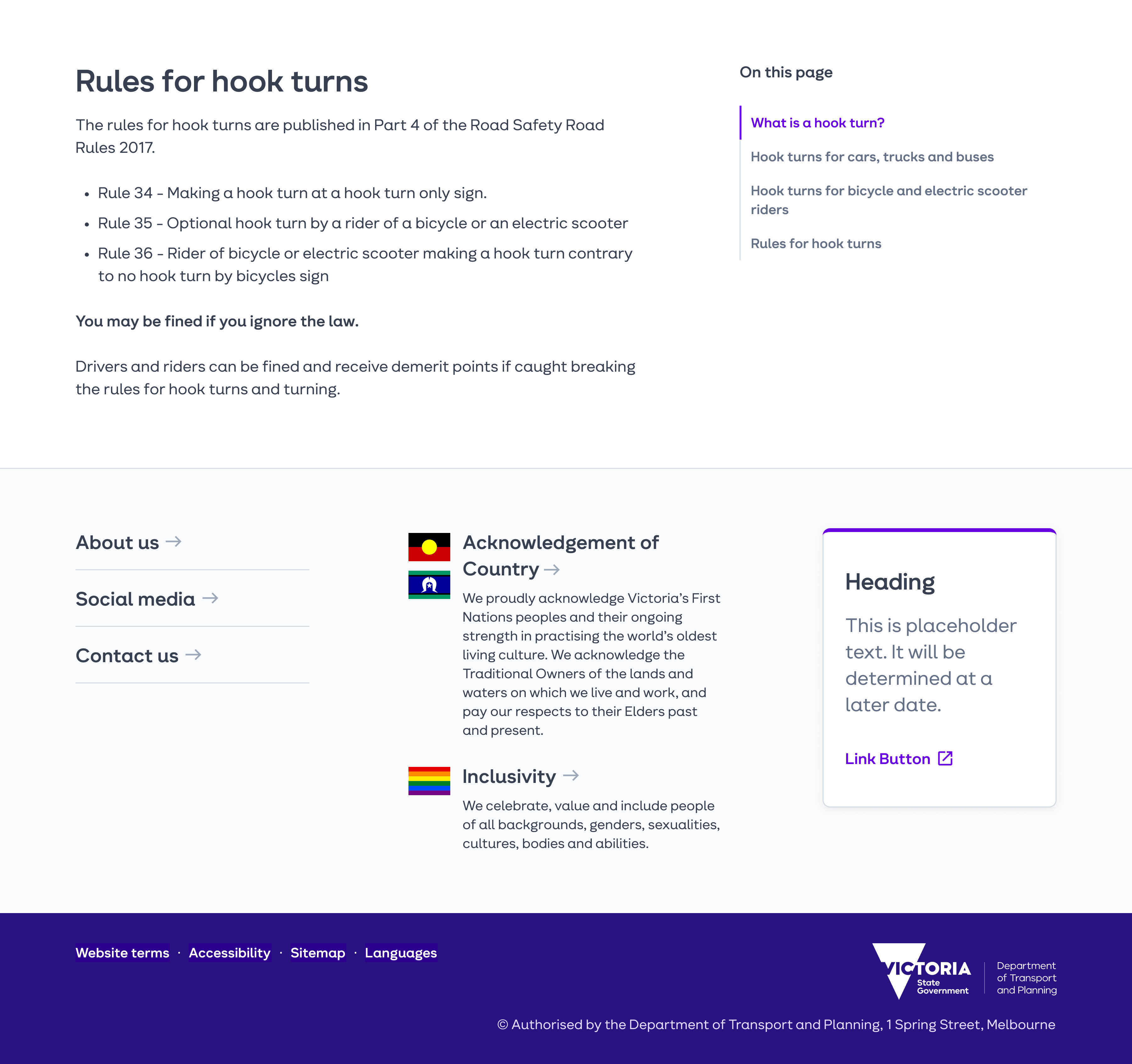
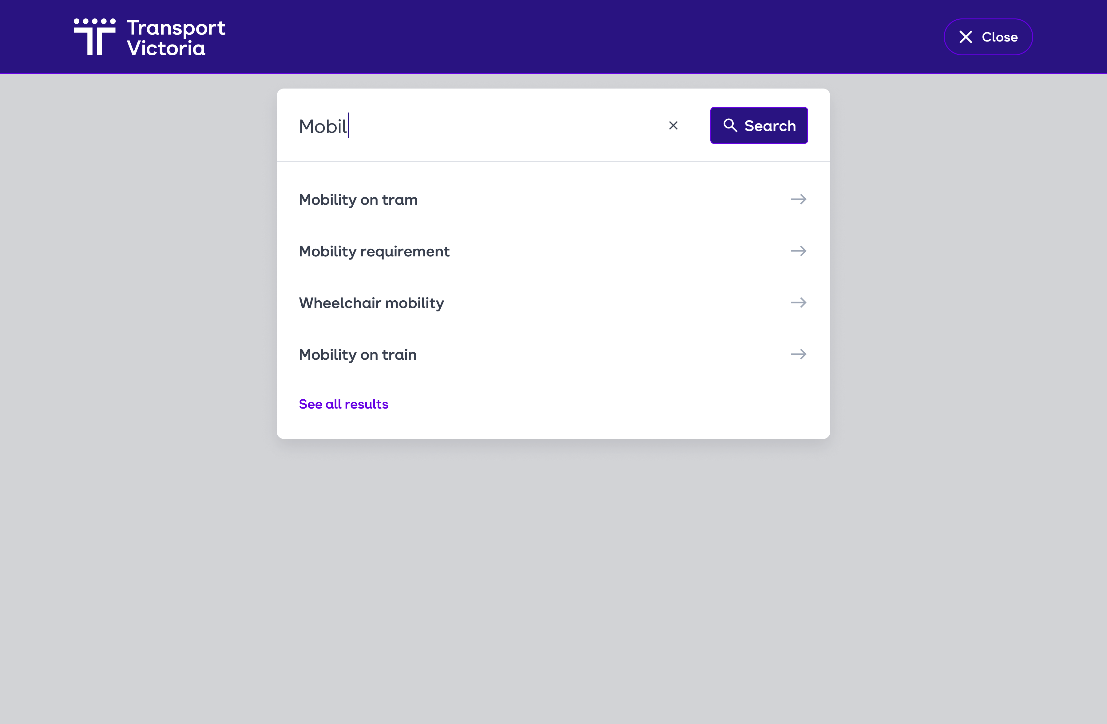
Once the design system was in a good spot, I switched my focus to designing reusable CMS-based templates and custom pages that would later be used by content authors. These were reviewed by the rest of the team in terms of ticket writing, development effort, user experience, etc., so it was definitely a team effort. To ensure these designs were more than just a pretty picture, I planned and conducted user tests, including tree testing and prototype testing, with the tool UX Tweak. I worked closely with the UX designers to synthesise and integrate any changes required.
Now I know I’ve made this sound like everything went smoothly, but of course, it wasn’t without its challenges! The biggest challenge for myself and the team being the scope changes along the way. This meant quickly switching focus and updating previous designs to fit the new scope (as well as going through review processes again). Granted, it wasn’t quite as bad as it sounds thanks to the component-based designs. A simple change in one place would update all instances.
Results
